Showing posts with label OUGD 103. Show all posts

Sunday, 31 May 2009

OUGD 103: Evaluation

What skills have you developed through this module and how effectively do you think you have applied them?
Through this brief, I have learned to depend more on other classmates and their opinions. I was very open to asking people what they thought worked best design wise and (usually always) colour design.

My InDesign skills have improved dramatically since the type and grid sessions and I hope to use this program more in the future. It was usful understanding the fine techqnique that goes into making such things like newspapers and magazines and it is certainly somthing I will keep in mind for the futre.

What approaches to/methods of research have you developed and how have the informed your design development process.

For this brief I've looked in a number of different places to gain research, information and inspiration. I relied allot on my younger brother for his input into ration packs and the general army cadet life. He also let take apart one of his ration boxes to record pictures of. I also compiled a few questionnaires for the 'speaking from experience' brief which proved useful in finding out just what sudents would want to survive on in that first week.

What strengths can you identify in your work and how have/will you capitalise on these?

I believe that my overall design skills have come along way since he beginning of the year. I now fully understand that not all design work is going to be about myself and losing some of that personality may prove beneficial to the overall result.

My packaging skills have also come along way and I was rather surpised to see that I had no problems with getting the correct measurements for all of the labels. This is an area I really want to look into some more and I hope to do more Brieifs that I can design packaging for in the future.

I've also found more skill in my Indesign work and I feel that the 3 DPS's that I did on Craig F where far better sturcted than the "What I have Learnt So Far" booklet we did in the last module.

What weaknesses can you identify in your work and how will you address these more fully?

I don't want to use this excuse but I lost nearly two weeks of this brief but I feel that if I sturtured myself proppaly then I probbaly could have had more work established.

I seem to have jumped the gun one again and gone straight for one idea and gone from there. There was not an awful lot of design sheets and I feel that I did not put these last five weeks to good use.

I had been worried before hand because I did not feel that I did too well on the last five week brief that we had and his time round I wanted to better myself. That perhaps because I had learnt from my mistakes before, I would not fall behind once again. This was not the case and I feel I could have more to show for my time.

This is the same problem I had with Type and Grid. This being because I did not quite understand at first and even though I took books out on the subject and looked it up online, I was still simply baffled. After talking it through with Lorenzo one on one though, I seem to have the hang of it now. Perhaps next year these skills will be a little more polished and refined.

Identify five things that you will do differently next time and what do you expect to gain from doing these?

1. To try not to dwindle because five weeks is not a lot of time when it comes down to briefs like this one.
2. To have more worksheets and design ideas before jumping the gun and sticking to one idea.
3. More research into my target audience and pin pointing exactly what it would be that would suit their needs and tendency's.
4. To not worry about making something look neat (work book and work sheet wise), but to simply get on with the idea at hand. I can always come back and work on it later if I do not think it is up to scratch.
5. To not leave things until last minute.

How would you grade yourself on the following areas:
5= exellent, 4= very good, 3= good, 2= average, 1= poor

Attendance: 3
Punctuality: 4
Motivation: 3
Commitment: 3
Quantity of work produced: 2
Quality of work produced: 2
Contribution to the group: 3

Friday, 29 May 2009

Finished Project

Thankyou Tim for being a model!

Finished Ration pack for first year students. As not to strave in their first week if the student loan hasn't come through and they don't have their parents to depend on.

Went with a more rustic and "stoney" fel in the end. I think It works well with the army themed idea.


Thursday, 14 May 2009

Design Direction Board

It's not pretty and I'm not proud of it but it gets it's haphazard point across. (I only had a night to do it seeing as how I wasn't in the previous week)


Sometimes I have trouble speaking and will stop for along time in the middle of a sentence. My crit group where really good about it though and gave me a helping hand. I now know what kind of direction I should be taking this breif. (I've also dropped the idea of drawing characters for personifcation...takes too much time.)

Friday, 1 May 2009

Speaking from Experience

New breif and this time it's looking at our own personal experience from being a first year and how we can help next years newbies. (or not help them.)

What is the problem?

The the first years come into all this sudden money that they have not bee used to before. Silly spending ensues on non essential goods and their food budget is cut considerably. Up until the next Loan installment, not everyone has enough money to eat.

What are you going to do about it? (identify, inform, promote)
I intend to Promote a ration box for the 1st years that they can use in case of emergency's.

How are you going to do it?
By researching various existing ration boxes from all kinds of backgrounds. Also looking into what cheap pre-packeaged food exists in the current market. (nothing that needs to be frozen or refridgerated.)

Friday, 3 April 2009

Re Design: DS Books

Here is the re design for the DS Books. After swapping our Briefs with Ben and Kate, they gave us an audience direction that we where previously lacking.

The new Boards: (Will be updated when Blogger decides it wants to play nice.)

The original colours where going to be this: (But as you can see it did a better job of burning retina's than it did advertsing an online book club. So we fiddled around with the colour schemes and settled on yellow and green. We thought perhaps this could still be deemed as feminie but not as in your face girly as the pink was. (Not ever girl likes pink or likes to be asociated with it.) However the image I made for the magazine advert was deemed (In our prestaation) asociated with a very young feminie market. With this new information I think our target audience could be that of "cosmo girl" instead of young woman.

This in it's self changes our whole concept from getting woman in the 20-35 bracket to ingage with reading through the Nintedo DS book feature and online book club. It could now be appiled to young girls with the same aplication of book club feature through the nintendo DS.

I've found a differnt type of Book club recently. A couple of Marvel Artists have a Pod cast book club running where they discus graphic novels and comic books they have previously read. Who says the market doesn't exist. ;D

Sunday, 22 March 2009

Team Diabolical


The mock ups Promo Boards (see previous posts) had spelling mistakes in the Johnny pointed out for me. Luckily I got them fixed in time.

New Proposal:
From the feedback we got for our presentation, we realised that we had completely missed the point about communication is a virus. Our new proposal is still to promote DS books, but through actually files you can download from the internet that can be swaped around with friends.

There was also a point reaised about narrowing down who out target audiened is, not just nintendo users themsevels.

Saturday, 21 March 2009

Virus Brief

Task: Getting People To Read More

The Brief:
To promote reading in conjunction with World Book Day via means of the Nintendo DS. It focuses on commuters who like to read on their journeys and how they can benefit from owning these products.

There is a pre-existing book feature for the console, is there space for more? Or will the book feature itself be enough to promote itself?

Concept/Proposal

The age old foundations of our linguistic development lie in books and what has been recorded in them. How can this be put into an engaging 21st century context?

Tone of Voice

Friendly, inviting and nothing to controversial, as the audience is broad and you need to captivate the existing market that Nintendo have.

Deliverables

Posters, flyer's in the public domain that is relevant to the brief. Mock promotional skins that would persuade the consumer to buy the book feature.

Considerations
Limited to 3 colours, however one of these colours must be stock. (red, black and white.)

What do the commuters see everyday and where will they go? You need to make sure that they are captivated or inspired by what they see and what they are going to buy is worthwhile.

You should consider how World Book Day promote themselves and see how you can tie it in with pre-existing promotional methods. Do it need improving? Are there other ways that this can be achieved?

The message need to include both type and image, as they are fundamental in selling what you will be saying.

Do you need they product on view? Or will use of differnt imagery benefit?

Mandatory Requirements
Keep it legal, you don' want to get arrested and not see your ideas bloom.

Thursday, 19 March 2009

Nintendo I presume...

Proposal boards for Nintendo DS book promotion.
Made poorly by yours truly, sorry Tom.


Tom has the layouts at the moment but they will be included on the 3rd board in due course.

Virus Brief...

Will fill in when i've had more caffeine.

Tuesday, 17 March 2009

A Sub-Microscopic Infectious Agent

That would be virus to you and me.

"Communication is a virus, how does it spread?"

New brief and this time it's a collaboration.
My parter in crime is Tom

He needed someone with "savy" software skills and I needed someone whose hand writing didn't look like spiders dancing in ink.

Despite what certain people have said, I think we'll make a good team.

Task: To get people to read more.

Perfect, both Tom and I really enjoy reading.

Why have you chosen this task?
Tom: Because i like reading and i think epople lose allot from not doing so.
Leigh (me) : I enjoy reading more so that watching TV. In my opinion, more people should do it!

What are my specific areas of creative interest in this task?
Tom: Book cover design, hot to make books cool-ads, type, ceontent.
Leigh: Decent book design (badly designed irritates me, Anita Blake prime example.) Actual content, writing, fandoms.

What specific design skills do you have to offer in relation to your chosen task?
Tom: Crafting, concept spooling, ideas, researcher
Leigh: illustration, layouts, knowledge of software (savy)

What specific non-design skills do you have to offer in relation to your chosen task?
Tom: Concepts and Idea generation, good with rhymes & writing, research
Leigh: Good Imagination, concepts, idea generation, humour

What will your specific roles be in the collaboration in the relation to your brief?
Tom: researcher, concept and idea generator, crafting
Leigh: software, concepts, layout, type, illustration

What will your individual responsibilities be in relation to your brief?
Tom: researcher, concept artist
Leigh: Concept artist, layouts.


What will you joint responsibility's be?
Discussing concepts and where we are going with it. Evaluation and statement of itent, visual, development, crits and blogs.

Signed and dotted in blood.

How To....Final.

Final piece, self Evaluation and Feedback...

(will update at a later date)

Sunday, 15 March 2009

Nearly there...

I had no binding tape so I used masking tape, magic tape and...*cough* toilet paper. It worked just as well so...

My sewing on this thing is appalling but it held it together so that's all that matters for the mock up version.

The first cover I made was streaky from ink running out and then bubbly from the glue so that was binned. The second one was the wrong measurements so that's now part of my experimentation work...But the 3rd one, after tips from my class mates...worked perfectly.

I have some typo's to fix on the main content of the book and then it should be complete.


Wednesday, 11 March 2009

Not Quite

It's not quite finished yet but here's the content of what is actually in the little A7 perfect bound book. (Which currently looks like a disaster waiting to happen =D)


And here's the cover that I'm to put on the front of it. It's currently just the contents of the book. I tried to bind it all together this morning and it did not go the way I planned. So i'll have to try and re bind it in class with a print out that is not streaky.


It should work...

Monday, 9 March 2009

Crazy Little Mock Ups

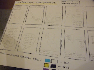
Using the list of Office Pranks I came up with some mock up's for "The little book of OFFICE REVENGE!"


Playing around with differnt fonts and colours and working on A7 format, which I really want to use for this little book of revenge. I want it to be simple, it doesn't have to be this over complicated thing.

Such Little Books

So I was a little stumped at first on how to approach this new brief. I looked at several differnt things like sprucing up a Employee's handbook to motivational posters. Neither one of them really got my interest so I moved onto looking at just how people try to resolve conflicts.

Americans are good at confronting people, but we the British (well most of us) are not too good at it. Who wants to approach the guy they really don't like and then try to tell them how much they annoy you. Would you want to work with that over your conscious?

So I began looking into Practical Jokes that can be pulled around the office. Simple ones like whistling everything you pass your target to outrageous ones like sanding down their desk each night for the next several months.

At first I looked at putting these jokes on the back of some very professional looking business cards. Overall, people liked the idea but it was pointed out that if they're business cards, then why would you have jokes on the back. I admit I hadn't thought about this but then little books where mentioned and I started to look into them.


I have a simple idea but I think it might work...

Tuesday, 3 March 2009

Problem Analysis

How to... Resolve Conflicts At Work

Who needs to know?
People who are dealing with conflicts or bullies in the work environment. (Workers annoyed by other colleagues)

What do they need to know?
They need to learn to approach the conflict in a suitable manner, as not to worsen the situation.

Why do they need to know? (What are you aiming to achieve by informing them)
So their time at work is a lot more enjoyable. Or atleast a little more tolerable.

What will they respond to? (What do they watch, buy, see, complain about etc.)
Motivation Posters, Information leaflets. Amusing slogans?

Where do they go? (What forms of communication do they come into contact with)
Internet - Blogs
Magazines
Posters
Work Place
Job center

Random Brief Is Random...

New Brief on Monday and this time it's a two week one. Oh what a random brief it is. We all had to pick a number between 1 and 1000 and I picked 42 without realising what was going to happen next. Then Fred, with his trade mark grin brought out the book "How to do (just about) everthing)...and each one of our numbers defines the topic.

42: How To... Resolve Conflicts in The work Place.

That'll be easy...Don't turn up. =D

The Final Image

My comment: Children are often thought of as Pure... Children are growing up far too fast, defined by the mistakes and beliefs their Parents put on them. They are almost warped into these little machines that need to be updated and programmed on a regular basis. Unfortunately, machines can break.

I had ten minute to upload it and had written nothing, so word vomit happened.

Overall I am not pleased. I like the shorter briefs, but....I think it could have been better. Going to re work it for submission. I really appreciated the the helpful comments about working with differnt paper to print the design on. I'm also going to look into defining it more as an image.


Don't Panic: http://www.dontpaniconline.com/designaposter/entry/?id=5544

Monday, 2 March 2009

Progression Of Pure

So far I have really enjoyed this brief. I haven't been able to just sit and draw for a long time and last Wednesday was a really good day for this. When I get hold of a scanner that knows it's a scanner (not a a huge plastic box that talks) then I'll post some full work sheets.

I really enjoy character design and pin pointing exactly what someone is going to look like. So when I first started with rough ideas for this piece, I had already moved towards narrative and story telling. (I suppose that's just one of the ways I work.)

For now though, some photographs of the concept work and layouts. At this point I had two main ideas, not just one but they both reflected back into one and other (see statment.)


I liked the boys better but I went with female in the end. My concept went over a little better with pure children...and bloodied hands. Hmm. At that point I really had no idea where I was going. So much so that in the crit i stuttered and went: words words Blughgg. I think I need to work on presenting a little more.

Concept Statment

Will be filled in when I retrieve from the drawer I left it in...whoops.

Rationale
- The underlying principles or beliefs that shape and defines an individuals view on design practice and how it relates to the world.

PURE=

What is your message?


What do you mean by this?


Who is your audience?


What will they respond to?


What is your content?